My UXStory Tool
The Challenge
My team was given the challenge from Victoria University to design a tool that could support emerging designers (e.g. students) in their early design careers.
Client
Victoria University of Wellington
Time Frame
12 weeks
My Role
Lead research and test. Design supporter
My Tool Kit

The Problem Statement
After finishing their studies, the UX field can be an overwhelming place for a junior designer.
Using overseas research and building on it, we investigated what makes a great design practice and looked into the kinds of challenges faced by UX practitioners and students in New Zealand.


The Team

The Design Outcome
myUXstory is a digital tool concept that builds confidence and encourages reflective learning to help students grow their design practice.
Connecting student projects with takeaway skills, mystory.
displays a visual map of the student's "design identity", allowing them to target areas to improve, locate resources and build assurance in their abilities to help in the search for that first role.
What I learnt...
Flexibility
is the key
Working on a project that mirrors our future work and getting to hear from seasoned voices has really opened up my outlook on this field. It's shifted me away from rigid thinking to a more flexible mindset.
Adaptive to a
virtual world
Engaging with people virtually creates a distinct atmosphere. It's become essential to hone the skill of compensating for the lack of physical presence.
The importance of the gratefulness
Acknowledging that everyone is doing their best despite personal challenges underscores the importance of expressing gratitude. Taking a moment to thank others for their contributions becomes increasingly vital in fostering a supportive and empathetic environment.
How we got there...
Dividing the problem into topic areas helped to focus our research.
We did this by discussing our assumptions and framing the problem into three HMW questions.
The emerging Student Desingers
For who?
HMW?
-
...build confidence in juniors?
-
...identify a great design practice?
-
...understand the value of UX in business?
Who could help us?
Designers with Industry experience
The Research
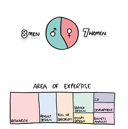
We spoke to a diverse group of practitioners with first-hand, design industry experience.
The interviews provided the detail of the challenges, what they believe makes a great design practice and how they see UX developing. We were interested to see how they expressed their process so we also asked them to visualise it with a sketch.
To check our assumptions, we investigated the perspectives of our student peers.
In order to obtain a large response quickly, we conducted an online survey and had informal conversations with students where we learned about the struggles with their learning experience.
1-to-1 interviews
Overseas insight
Desk research
Quant survey
Literature reviews
Process sketch task
Insights
Junior designers tend to stick to linear processes that they are familiar with
because they haven’t had the time or experience to learn alternatives (like seasoned practitioners have) which means they are more likely to get “stuck” when projects don’t follow their known process.
Universities can’t prepare UX students for every eventuality in the workplace
because business organisations are diverse in sector, size and maturity which causes students to feel anxious, overwhelmed and unsure about their transition from academic study into the industry.
Seniors don’t expect juniors to know everything at the beginning - they just want them to be open to feedback and learn
because design is a process that requires constant learning as technologies and human needs are ever-changing which means design is encouraged to be a collective process by asking for collaboration when they don’t know the answer.
UX and business often embody opposing practices (the former holistic and the latter customer/profit focused)
because the two fields practice different mental models towards effective problem solving which can cause friction and tension between the two disciplines.
The value of user-centric design is often questioned/ misinterpreted as purely visual design
because the intangible outcome makes it harder for non-designers to understand its worth. The consequence is UX practitioners (juniors & seniors) have to work harder to justify the benefits (e.g. revenue, reputation etc.)
People skills/soft skills are vital in the design fields
because design teams work predominantly in cross-functional and collaborative teams which means designers need to be able to collaborate and work with other professionals/disciplines.
When solving design problems, junior designers tend to think they need to know all the answers
because general mental models are geared toward “finished” outputs (vs. user-centric which is more holistic/ambiguous) and this causes the junior designer to feel emotionally fraught.
Junior designers rely on a range of resources to help support their design practice
because they are still learning and tend to be more anxious (than seniors) about working with ambiguity. Having less time in the field means junior designers find it harder to identify the relevant/credible resources they need.
Companies are hesitant to hire junior designers thinking they have to spend time/ resources bringing them up-to-speed
because academic study can only give students a snapshot of the various specialisms/ companies which means it can be difficult for juniors to find the right jobs and/or teams that help them grow as designers.

Visual Interpretation

Problem themes
From the research & visual insights, we identified these core themes to the problem space:

These three HMW are related to each other. If we get a junior to find their identity as a designer, it will help them come out with more confidence to venture out and trust in the process. If I know who I am and trust the process, I will have a firm foundation to be able to communicate the value of UX to other disciplines.
Redefining the problem.
Many design skills are acquired with experience and juniors are still figuring out "who they are" as a designer. This inexperience affects their mindset causing them to feel overwhelmed.
New design brief.
The solution should enhance the learning experience by helping design students recognise their abilities and encourage a growth mindset that can help them to define who they are as a designer and trust in the journey.
"Mindset, not skillset."
"It's more of a mindset than a method"
"Skills are temporary and shift with time...mindsets are more consistent and part of a person"
Design exploration
Workshop activities and some of the answers
To begin the ideation, we ran a workshop with students and design practitioners.
The aim was to generate as many ideas as possible to help design concepts.
It was less successful in generating tangible ideas, but the participants unanimously agreed on the value of being able to tell your "story". This drove our concept generation phase.


Digital gardens concept
“Gardens present the ideas of an individual”*
*Maggie Appleton, A Brief History & Ethos of the Digital Garden, Jun 2020
We came across the concept of “digital gardens” - online spaces that focus on documenting process/ craft with key differences from standard blogs:
-
Rather than organised chronologically, content is organised by topics, concepts and themes.
-
Changing the mindset of “finished” or “done”- gardens are a continuously evolving W-I-P piece that grow over time. Digital “gardening” should be low effort, (just like a real garden) - tending to it is part of a daily ritual.
-
This is a really interesting concept - information becomes a living eco-system, growing over time as the user adds to it, building up their story.
Creating the concept
We opted to develop a personal matrix concept which helps students to build their "story" map visualisation using their project learnings as a starting point.


What would the user do?
-
The student inputs what they learnt into the matrix by recording their UX "activities"
-
They rank how each activity went for them, e.g. love it or need to improve
-
They will have tools and feedback to improve the skills with which they do not feel confident.
How would they do that?
-
Follow a prompt to reflect after a project submission
-
Complete a survey that has been structured by the lecturer
-
The results turn into a visualisation "story" map
Why would they use it?
-
They can visually see their "story" growing or navigate toward practice areas
-
They can use the results to prep for things like case studies, CVs etc.
Usability testing
We realised two rounds of usability tests with design students, and used their feedback to reform the concept further.
The participants were asked to complete tasks so we could check if they:
a) understood the concept,
b) could follow typical flows and
c) if they thought the results would provide value to their learning.

.png)
Paper Prototype
A low-fidelity paper prototype allowed us to quickly test user flows and comprehension.
Testing the end-to-end flow was incredibly insightful as it gave us rapid user feedback and validated the overall concept to continue taking the design further.
.png)
Outcomes
Paper prototype
Use friendlier
language
Competency tags need a rethink - students found "Confident" to be intimidating so we changed to the friendlier term, "Comfortable". "Attempt" also caused confusion so changed to "Ready to Try".
Story map, yes
Soft skills, no
Students were intrigued by the story map, correctly understanding it represented their abilities. But they did not interpret the holistic soft skills layer for the project,
so we separated the two maps.
Reduce
the cognitive load.
The curated resource list (and bookmark) was appreciated by the students but they found the long list overwhelming. We simplified this with a separate pop-up, displaying just 3 options to direct the student
Digital Prototype
A digital prototype (v2) gave us a closer look at user interactions and check if the iterations had improved the experience.

Outcomes
Digital prototype
Positive design wins
-
Friendly language was appreciated by the students - "It's nice and casual...it feels like someone is talking to me."
-
Tooltips were easy to follow - students liked the onboarding was short - "I can see it only has 4 pages to flick through".
Minor adjustments
-
'Welcome' pop-up appears late in the flow -"I feel this should appear at the start"
-
Students understood the separate soft skills map but had a negative response to the icon - "It reminds me of the COVID social distancing icon!"
What needed a rethink
-
Unclear Preview page - "Am I meant to edit this?" - the layout & writing was re-considered to make the page more obvious
-
Soft skills map felt basic next to the colourful Story map, "It's a sad colour...greys don't make me feel good about my soft skills."
Wireframe
